Learn · Design
Presentation design principles that work
Presentation design is hierarchy under time pressure. The audience has seconds to find the claim, the proof, and the implication. Fancy decoration that slows that scan is not design, it is noise.
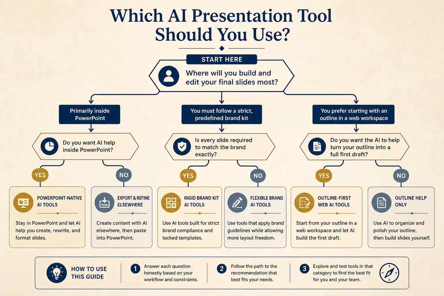
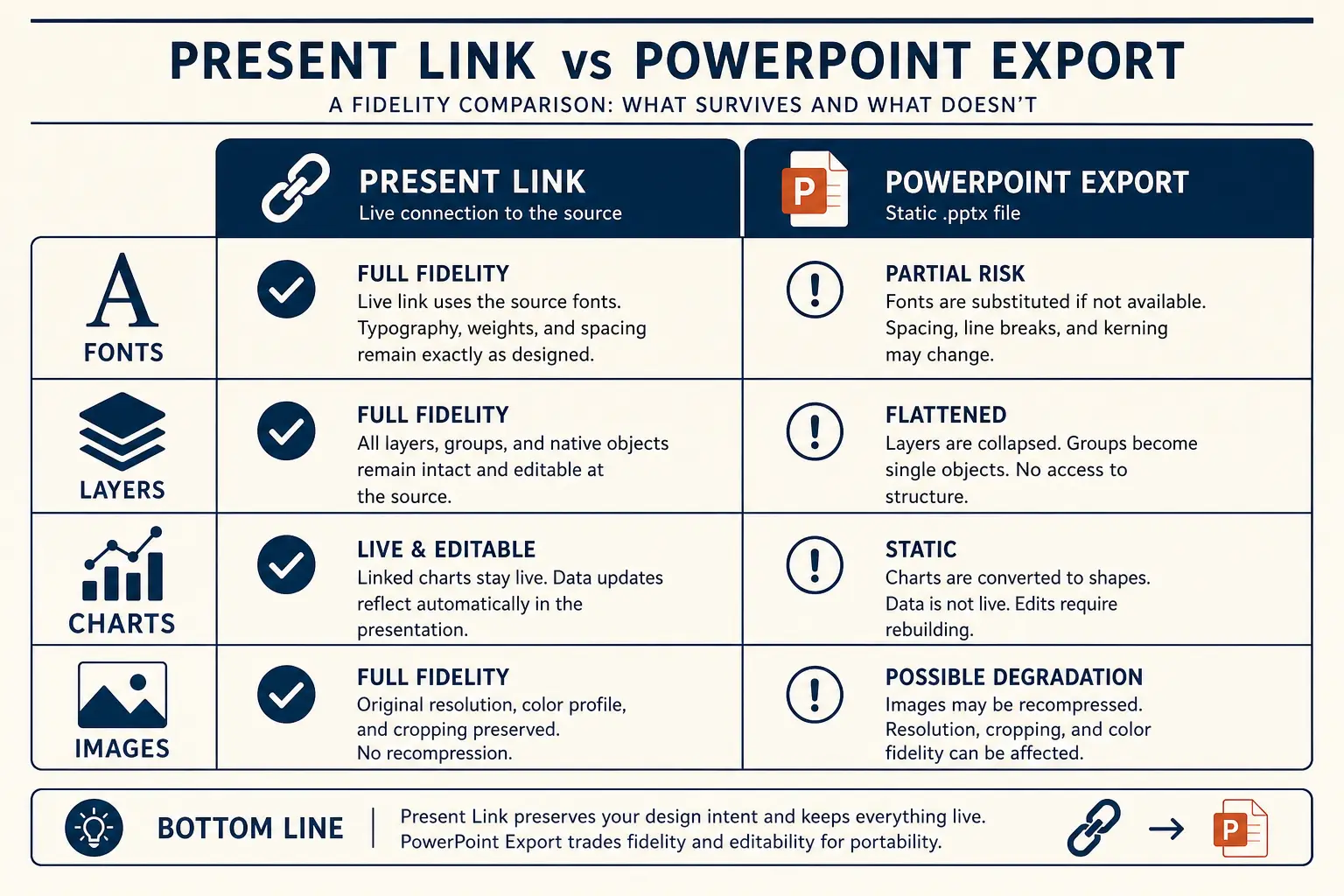
This hub covers principles you can apply whether you draft in Gamma, PowerPoint, or Keynote. Pair it with the AI presentation maker when you want structure and layout drafted together, and with fixing generic AI slides when the first draft looks fluent and empty.
Anatomy of a claim slide
Claim headline (one idea)
Supporting line that states the so-what for this audience.
Source / footnote
One idea per slide
If you need a paragraph to explain the slide title, the slide is doing too much. Split. Titles should be claims (“Activation stalled after invite redesign”), not topics (“Activation”). Body text exists to make the claim believable, not to reprint your doc.
Density is contextual. A board packet leave-behind can carry more text than a keynote. A live sales demo should be sparse. Match density to delivery mode, then stop adding. Useful edit pass: read only the titles in order, if they do not tell a coherent story, fix titles before touching colors or imagery.
Slide density spectrum
Sparse
Live stage
1 claim, huge type
Balanced
Default
Claim + 3 proofs
Dense
Leave-behind
Detail for async read
Hierarchy beats ornament
- Size and weight signal importance before color does
- Alignment and spacing create groups faster than boxes
- Contrast must work on projectors and laptop shares
- Icons are labels, not evidence
AI tools often over-decorate because decoration looks “designed” in thumbnails. Delete anything that does not help the claim. Brand color discipline matters, see brand colors in AI presentations.
Data slides that persuade
Start from the point of the chart, then choose the chart. Annotate the takeaway on the slide; do not assume the audience will find the inflection point. Avoid dual axes unless your audience already trusts them. Show definitions for metrics that executives argue about (active, churn, NRR). If the insight is “growth slowed in March,” write that in the title.
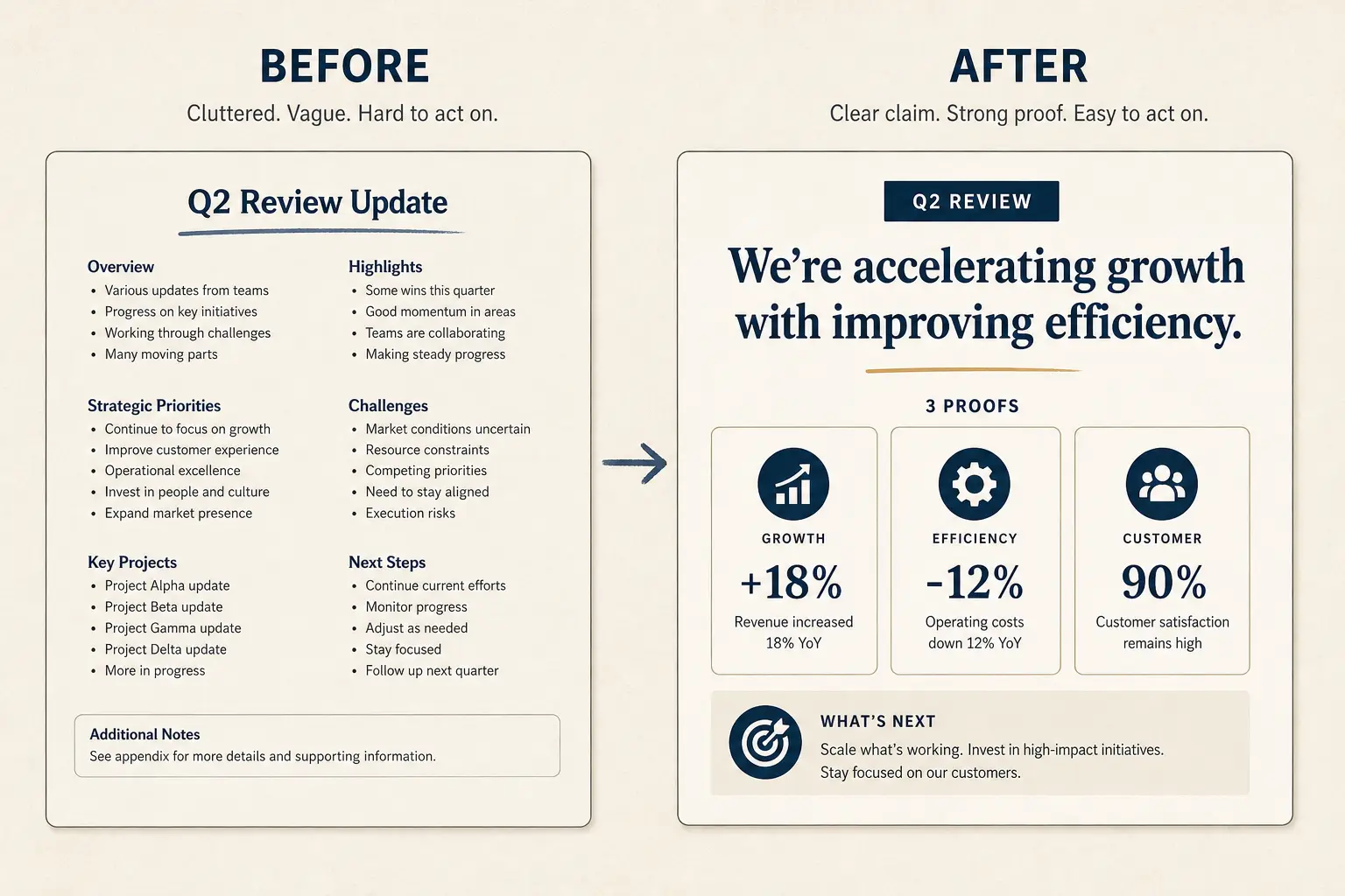
Weak slide → strong slide
Before
- • Overview
- • Features
- • Next steps???
After
- • Cost of status quo
- • Wedge in one claim
- • Proof + decision ask
Speaker notes are part of design
Slides are for the audience; notes are for you. Good notes hold the transition, the anecdote, and the fallback if time is cut. Bad notes duplicate the slide. If you cannot deliver without reading paragraphs on screen, redesign the slide, see speaker notes that work.
Framework: the brutal cut pass
Cut slides, rewrite titles as claims, remove competing focal points, move detail to appendix, then ask AI for layout cleanup. Order matters. Beautify-last is how you avoid polishing nonsense. Score AI tools on Design only after Structure and Editability on /method.
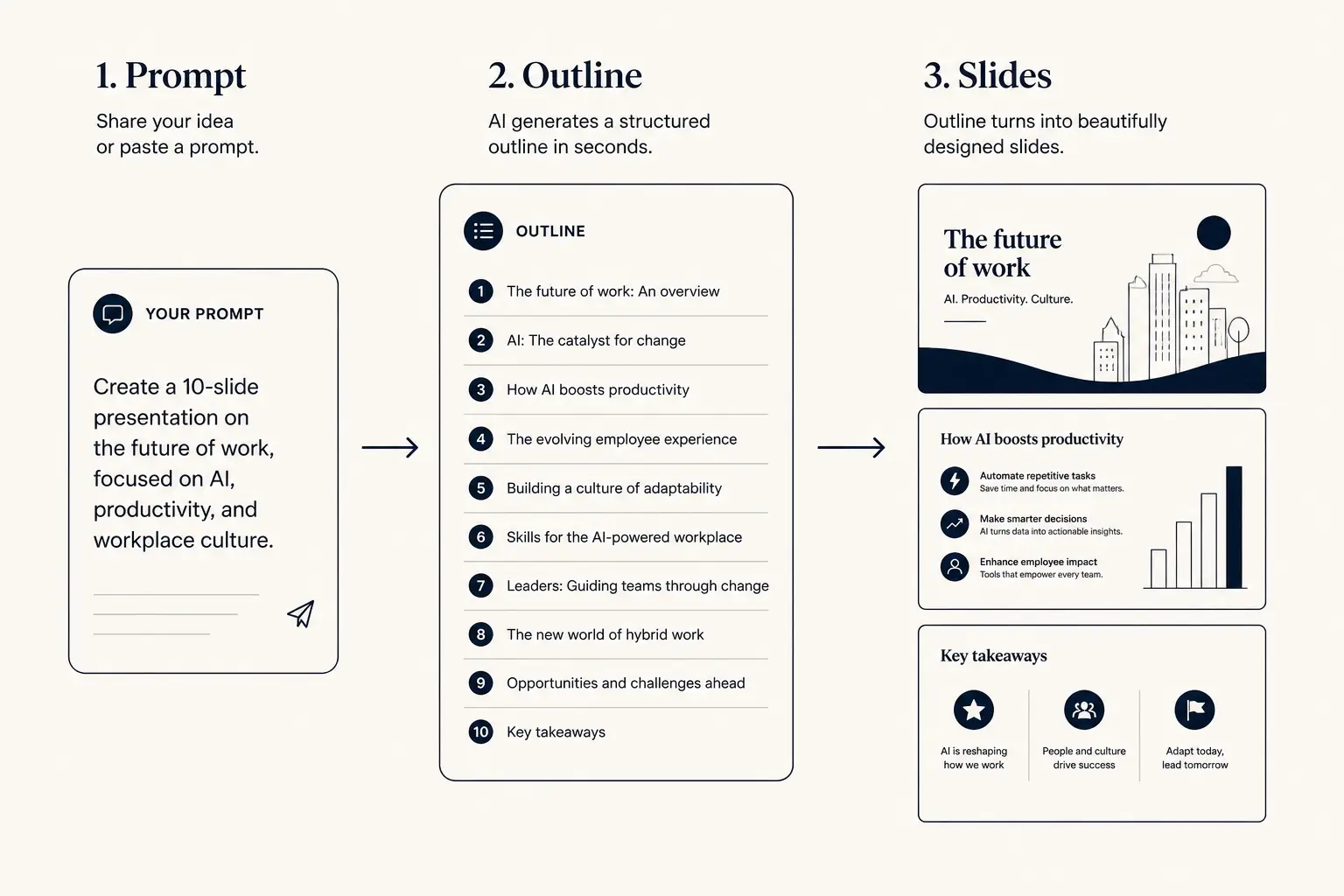
Prompt → outline → slides
1. Prompt
Audience, goal, length, proof you already have.
2. Outline
- • Opening claim
- • Proof beats
- • Ask / next step
3. Slides
Worked example: exec update makeover
Before: 18 slides, topic titles, three charts per slide, purple icons. After: 8 slides, claim titles, one chart with callout, appendix index. Time cut from 25 to 12 minutes speaking. The “design” win was mostly deletion and title rewrites, Gamma regenerated layouts after the outline stabilized.
Failure modes
- Topic titles that require body text to make sense
- Equal visual weight on three competing ideas
- Low contrast that fails on projectors
- Chart chrome without a verbal takeaway
- Motion that distracts in working meetings
Not for you if…
You need custom illustration and stage craft for a keynote, hire a designer. You need rigid enterprise masters across hundreds of users — brand-kit tools may fit better. You want decoration to hide a missing ask, fix the story first.
Time-to-usable-deck
Blank PPT path
Outline in docs → design fight → rebuild → 3–8 hours
Outline-first AI path
Prompt → edit outline → generate → polish → minutes to first usable draft
Frameworks, worked rules, and cuts
Presentation design is hierarchy under time pressure. The audience has seconds to find the claim, the proof, and the implication. Decorations that slow that scan are noise. Most so-called design problems are still structure problems wearing a nicer font. Fix claim titles before color, icons, or motion.
Original framework: the Brutal Cut Pass. Cut slides first. Rewrite titles as claims second. Remove competing focal points third. Move detail to appendix fourth. Ask AI for layout cleanup last. Beautify-last prevents polishing nonsense. Score Design on the rubric only after Structure and Editability are honest.
Worked example: an exec update makeover from eighteen slides with topic titles and three charts per slide to eight slides with claim titles, one annotated chart, and an appendix index. Speaking time drops from twenty-five to twelve minutes. The design win was mostly deletion and title rewrites. Layouts regenerated after the outline stabilized.
One idea per slide means titles are claims, not topics. Density matches delivery mode: sparse for live stage, balanced for default meetings, denser for async leave-behinds. Read only titles in order. If they do not tell a coherent story, stop touching visuals until the claim sequence is honest.
Data slides persuade when the insight is written in words beside the chart. Dual axes need an audience that already trusts them. Define contested metrics. Comparative insights belong on one slide, not two charts the audience must mentally overlay. AI often generates chart chrome without a verbal takeaway—delete chrome until the sentence is obvious.
Speaker notes are part of design. Notes hold transitions, anecdotes, and time-cut fallbacks. Notes should not duplicate the slide. If you must read paragraphs on screen, redesign the slide. Motion should guide attention in present mode, not decorate entrances for working meetings where people are trying to decide.
Failure modes include topic titles that require body text, equal visual weight on three ideas, low contrast on projectors, chart chrome without takeaway, and noticeable transitions in decision meetings. Brand accent color should signal status or CTA, not every bullet. Restraint reads as confidence in executive rooms.
Not for you if you need custom illustration for a keynote, if rigid enterprise masters are the primary constraint, or if you want decoration to hide a missing ask. Hire a designer for stage craft. Fix the story before templates. Concrete next step: run a title-only read, execute the brutal cut pass, then generate clean layouts in Gamma.
Before-after makeovers teach faster than abstract principle lists. Capture a weak slide with a topic title and competing focal points, then show the claim title, single focal point, and appendix move. Recreate that makeover on your own deck before you open a color system conversation.
Visual hierarchy is scan order: title, key number or chart takeaway, implication, source. If the eye lands on an icon row first, delete or demote the icons. AI layout defaults often over-weight ornamental side panels; strip them when they compete with the claim.
Projector and laptop rooms punish low-contrast grays and thin hairlines. Test one slide on the actual display when stakes are high. Brand kits that look elegant on a designer's Retina screen can fail in a washed-out conference room—adjust weight before the meeting, not during.
When Design scores high but Structure scores low on the method rubric, do not celebrate. Pretty nonsense is a known failure mode of AI presentation tools. Re-run the brutal cut pass and only then regenerate layouts. Design is last because hierarchy cannot invent a missing recommendation.
Brand color discipline: one accent for status or CTA, neutrals for body. AI themes that paint every bullet in brand orange create noise that looks on-brand in thumbnails and fails in rooms. Test a grayscale title-only pass before you commit to a theme.
Speaker-notes design check: if notes exceed what you can say in the slide's time budget, cut the slide or move content to appendix. Notes are a delivery aid, not a second essay. Time-cut fallbacks belong in notes so you can skip without improvising chaos.
Generate a clean first layout
Fix the claims in the outline, then let Gamma draft slides you can tighten.